Guidelines
Artwork PDF files are our preferred format type. PDF creation tools are available that will allow you to make a PDF from the most commonly used commercial and home/office programmes. Adobe Distiller is the most commonly used programme which comes packaged with Acrobat, however there are also many free or shareware applications that work to great effect, including Primo PDF and CutePDF.
Resolution
To ensure your files print clearly all artwork including images must be supplied at a resolution of at least 300dpi. Anything lower than this may result in blurry, bitmapped or pixelated print. Note: images used from the web are 72dpi and although they look fine on screen they are not suitable for full colour printing.
Colours
Frequently we ask if the colours for your print project are CMYK or PMS. To designers and printers this is common knowledge, but to a business owner who wants to print their logo or other branding collateral this question can result in confusion.
PMS stands for Pantone Matching System (PMS), a proprietary colour space used in a variety of industries, primarily printing, though sometimes in the manufacture of coloured paint, fabric, and plastics. By standardising the colours, different manufacturers in different locations can all refer to the Pantone system to make sure colours match without direct contact with one another.
Here is an example using the colour Green:
To print Pantone 362 it needs to broken down into four different parts.

To print this green we use the Pantone ink for Pantone colour 362 and it does not have to be broken down. If you have a logo made from this colour including different screens (shades) of this green only one plate would be needed for the logo.

The above image of the orange is an example of what happens when you convert a PMS colour to CMYK. When using web printers like Vista Print, or any other, they convert your PMS colour to CMYK.
At Words & Spaces we work with PMS colours on a regular basis. These colours offer a tonal range that CMYK doesn’t. We have swatch books that allows us to find the PMS value for any type of CMYK work you have done in the past.
A LITTLE MORE ABOUT COLOUR…
CMYK stands for Cyan, Magenta, Yellow and Black. These are the primary colours for print. Where we all grew up knowing Yellow and blue make green and yellow and red make orange, the printing industry grew up knowing that varying the quantities of cyan, magenta, yellow and black creates an endless array of colours to print.
PMS stands for Pantone Matching System colours. There can be so much variation in colour using CMYK that Pantone set out to create a system that allowed for consistent colour. This way a designer can create a logo that will print consistently from job to job and printer to printer.
PMS colours can streamline the process of printing and cut down on cost. CMYK colour always requires four plates to be made for a print to be made, while a carefully crafted one or two colour logo using PMS colours only needs two to print.
Bleed
Bleed is used when any part of an image, background, colour or line is to print the very edges of the finished product. For example if you wanted the background of a business card to be red, the colour must bleed past all edges. If not, due to minor variations in printing and trimming, white lines could be seen on some or all of the edges. The bleed requirements are 3mm all round. Text All text must be a safe distance from the edge, a minimum of 3mm is recommended.
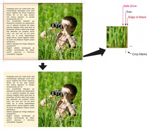
Safe Zones
AKA the “Safe Area”. This is a general “rule of thumb” that is widely used when designing artwork (Desk Top Publishing) and it’s a REALLY good habit to get in to. Most of the time when you are designing your artwork, you will have set up a margin all round each page. The Safe Zone is similar in many ways to this and it’s basically the area in which you put your text and main graphical elements. A rule of thumb is that the safe area should be around 4-6mm inside the page (trim). It has 2 main purposes. One is to do with style, but the second and most important reason is to do with function. With commercial printing, the tolerance for where the printed content ends up on the physical sheet is not precise down to thousands of a millimetre, rather the “worst case” is plus or minus 1-2mm (approximately). That’s why we have bleeds (see previous topic). For example: if you have the start of your text 0.5mm from the edge of the page (trim) and the content is 1mm out, some of your text is going to be chopped off. Take another example: you have a business card (or any other very small printed item) and you have a line of text centered at the bottom, 2mm from the sides and 2mm from the bottom. In this example, take the case where the content is out by 1mm in both directions (this is well within normal tolerances). The net effect is that the text ends up 1mm from the left, 1mm from the bottom and 3mm from the right. What experienced designers know is that the eye is immediately drawn to this level of imprecision. However, if the designer observes a “Safe Zone” of 5mm, the text would end up 4mm from the left, 6mm from the right and 4mm from the bottom and this looks much better.
If you have designed your artwork with bleeds (see the previous topic), then it’s perfectly normal (and in fact necessary) to have your background colour or images outside of the safe zone.
We sometimes don’t show a Safe Zone in our templates as it can over complicate them, but it’s well worth remembering and following this simple rule of thumb.